“ I redesigned a clean, uncluttered UI for our users and support their work . ”
2014.07~2015.02
Mail2000 V7 was a major UI/UX overhaul in 2014. Mail2000 is a well-known Email service for enterprise in Taiwan (called Cybermail in Japan), and our goal in this overhaul was to create a more fresh look that could easily grow and develop with our current and future customers, and deliver more usable features for them.
I have omitted confidential information in this case study.
my role
" How can a Gmail user (me) redesign a totally different Email system? "
For me, the sole designer on this project at the timeit, it was a big challenge: How could I realize the user and know what’s the goal of the UI overhaul as soon as possible?
For users, of course, no one likes change - Fresh vs. Familiar: How Aggressively to Redesign. Because users are concerned that they have to learn the system again and it’ll take time to accustom themselves to the change.
The worst case would be: We spend a lot of time bring a brand new UI but user feel upset and we lose part of them finally. In order to reduce any reprisal (such as user revolt) as possible as we could,
Make things clear. First, I made a list that including two main parts: 1. UI flaws in V6; 2. User Wish Pool in V7 after research. Then, illustrate the insight of these users including their needs and ideas. Meanwhile, I analysed what user desired and their attitudes.
Gain support. In order to share our concept of V7 and gain acceptance from involved members, I partnered with PM, starting to visualize our ideas quickly and draw an overview of what these features like, then, we defined the scope of redesign together.
Invite internal end-user to evaluate. Depending on different purposes in each stage, I created lots of prototype in order to conduct several usability testings to improve V7 before the formal release.
goal
(Note: “V6 user” means those end-user that use Mail2000 excluding administrator role in this article.)
" Refresh the UI, in addtion, deliver new feaures. "
It’s been three years since V6 launched (2011), over the past three years, V6 UI has been cluttered with lots of disordered features. So, we decided:
- Enhance the familiar. Similar to the past layout so that user could get used to it with minimal learning.
- Tidy. Provide a enterprise mail system with uncluttered and modern UI.
- Efficiency. Deliver an experience that easily access mails or attachements; user can communicate with each other more instantly and strengthen the productivity.
Challenge
Since each kind of overhaul would let users take a while to adapt more or less, the first impression would be the keypoint, and it determine whether or not user would accept or be willing to try to use.
" How could V7 attract both Novices and Experts User? "
- Our On-premises customers could be revolt or force us to customizes for them if they feel upset about the overhaul.
dicovery
V6 is in need of an update. As you can see below, our overhaul target - the old version UI of Mail2000 V6, filled with blazing colors (including some GIF icons). At first glance, it's hard to navigate and follow because there are a lot of elements (fixations) that distract users' attention. To be brief, too noisy.
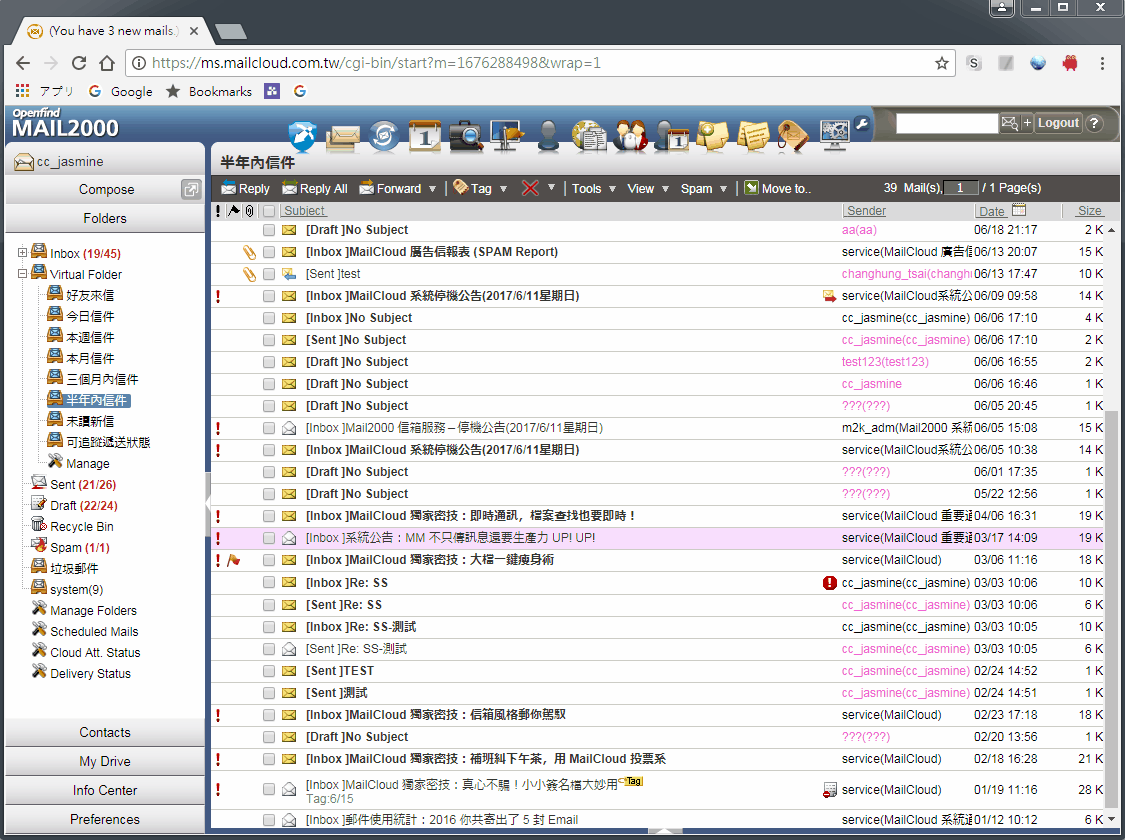 Fig. 1 UI of V6 (old version)
" Understand users' attitudes and opinions toward the present version. "
Focus Group Meeting. We redetermined 13 dimensions which is from V7 wishpool as subjects and recruited 8 end-users (4 on-premise users and 4 cloud users) to share and discuss their stories about V6 begin with these 13 subjects. These participants are adminstrators of V6 and they are the Executives of IT department as well, and they came from hospital, government angency or telecommunications. We collected lots of subjective feedback from them:
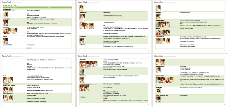 Fig. 2 Data of Focus Group Meeting
We found that daily behaviours were: Compose, Mail Management, and Find. Especially when composing in V6, users would get annoyed becouse the unfriendly UI.
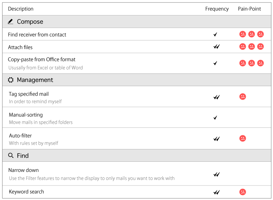 Fig. 3 Partial result we collected from Focus Group Meeting
" Observe their behaviour, realize their context and pain point, then design for them. "
I decided to let something happen when users are interacting with V6 and observe it, thus, I particularly chose two features which were used very frequently: “Compose” and “Mail management” and conducted usability testing (with think aloud) among three novice users: no experience of V6 but has experience using others and three expert users: three years experience, we found out:
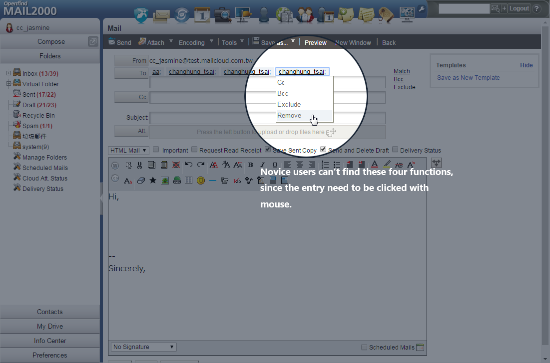
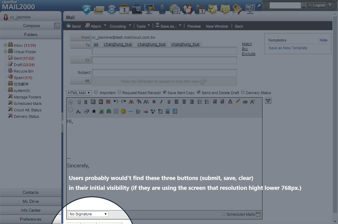
- The different kinds of mental model between Novice and Expert user. when typing sender, the interaction of autocomplete was obscure, not every action could use keyboard, such as delete unwanted sender; besides, it's hard for novice to distinguish the difference between indicated icon and clickable button.
- Error times is related to skill. The Novices usually slip when dragging files into a specified area to attach files.
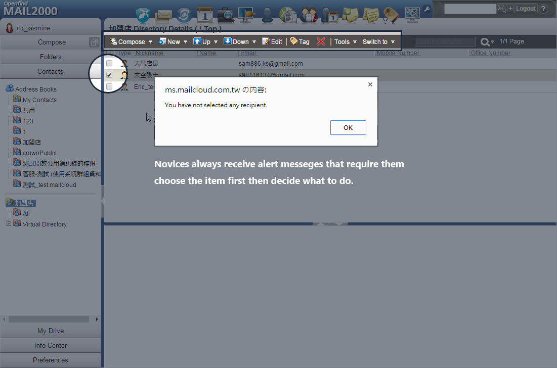
- Lack of feedback. All of these partipents don't understand has system responded the request or not. They spent redundant time double-checking if the request has been done or not frequently.
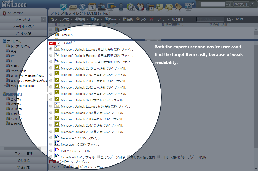
- Weak Readability. Especially for Novices, it's hard to easily scan (or quickly browse) all the imformation because disordered layout.
insight
Based on the results of Focus Group Meeting and Usability Testing, we realized our customers' behaveiours, and identify the real UI problems, we found some key insights that related to UI overhaul:
" Expert users interact with V6 depending on the memory of layout or position of features, while Novices interact with V6 depending on only the information and indicators. "
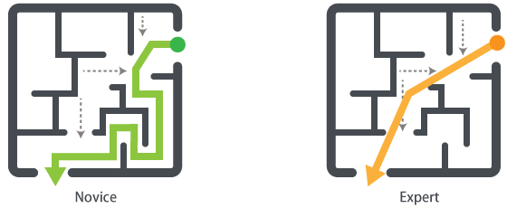
The Expert User (totally get used to V6) has their own path to deal with daily task. But they probably didn’t remember the name of the feature, (somewhat like we probably can’t answer the name of the street in our hometown but we never get lost.) That means, they’ve already accustomed to the conceptual model of V6, while novices, in contrast, no matter what task they faced, the performance and satisfaction were not very well, even though they spent time confused as what to do, inevitably, they failed after they done.
" Mastery. (I need to do that myself ! )"
Users want to totally control the system (however, that makes them exhaisted.)
In the enterprise, for instant, users cannot allow there is any mails be missed. A part of our users have already set some rules to sort mails into certain folders automatically, but they still always check if there is some misclassified mail. It doesn't mean they doubt the reliability of auto-filtering, they just always double-check their mails.
Design
Remain the layout and place controls consistently as possible as we can. We have already known that if we change the main layout (or the positions of some main features such as compose) would carry some risks because users will confuse at first and it also takes time to learn a new experience once again. On the other hands, we want to bring a simpler and clear visual style in order to we could deliver more usable features for our users, and, they will notice it.
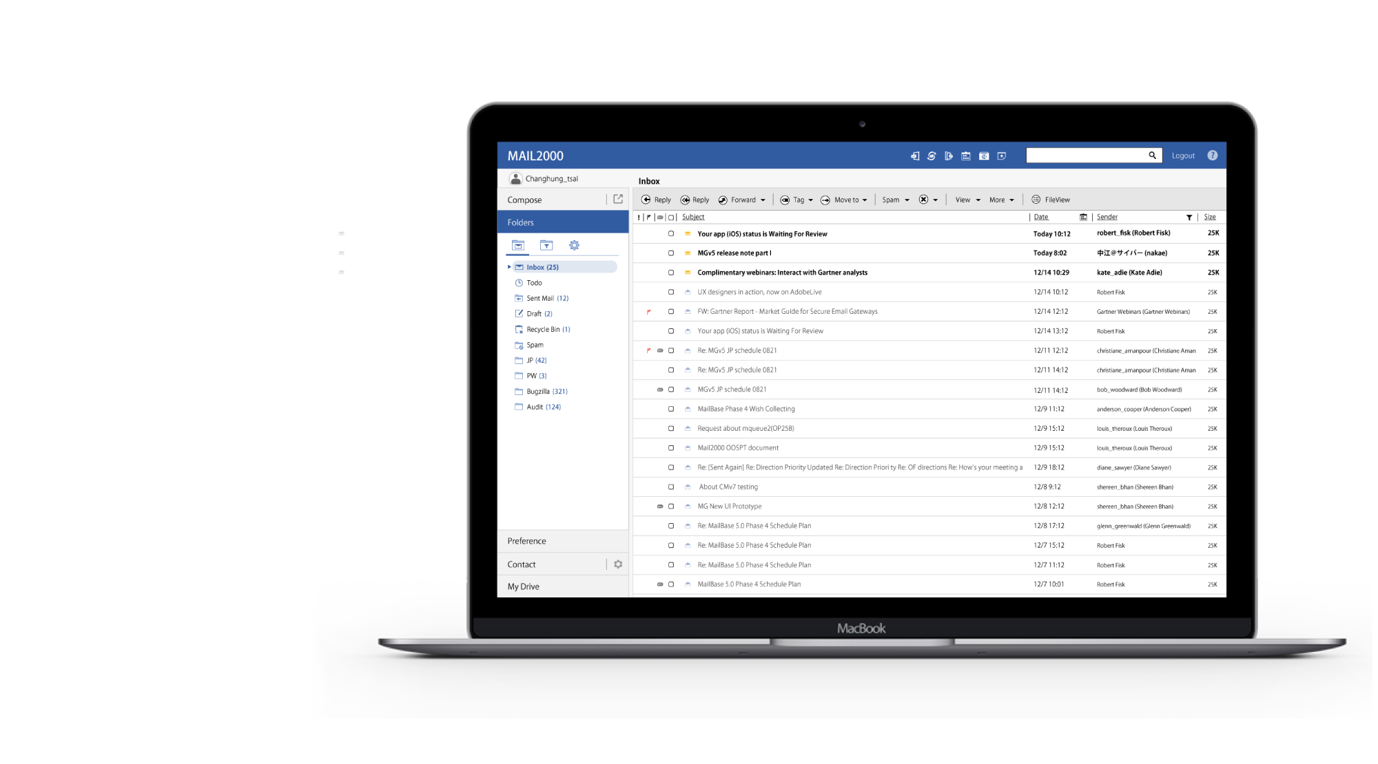
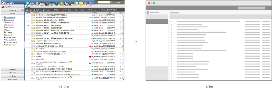 Fig.4 Main layout of Mail2000 V7
Make things recognizable quickly. Reduce unnecessary half pixels (eliminate the noise), increase the readability.
Simplify the flow. Intuitive!
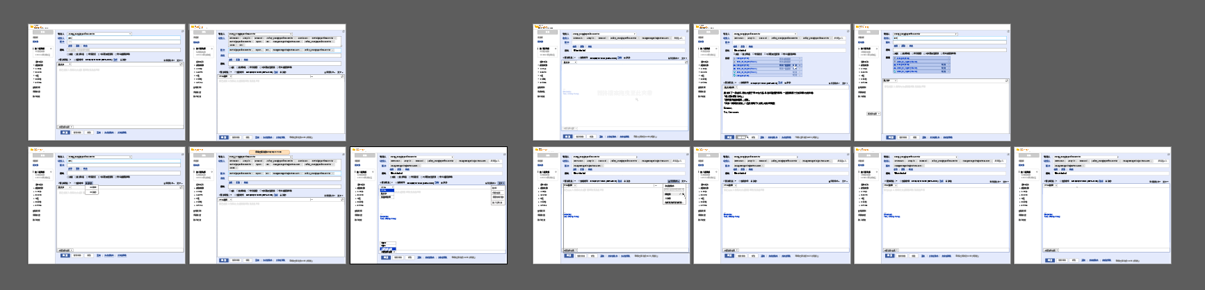 Fig. 6 Prototype of Compose
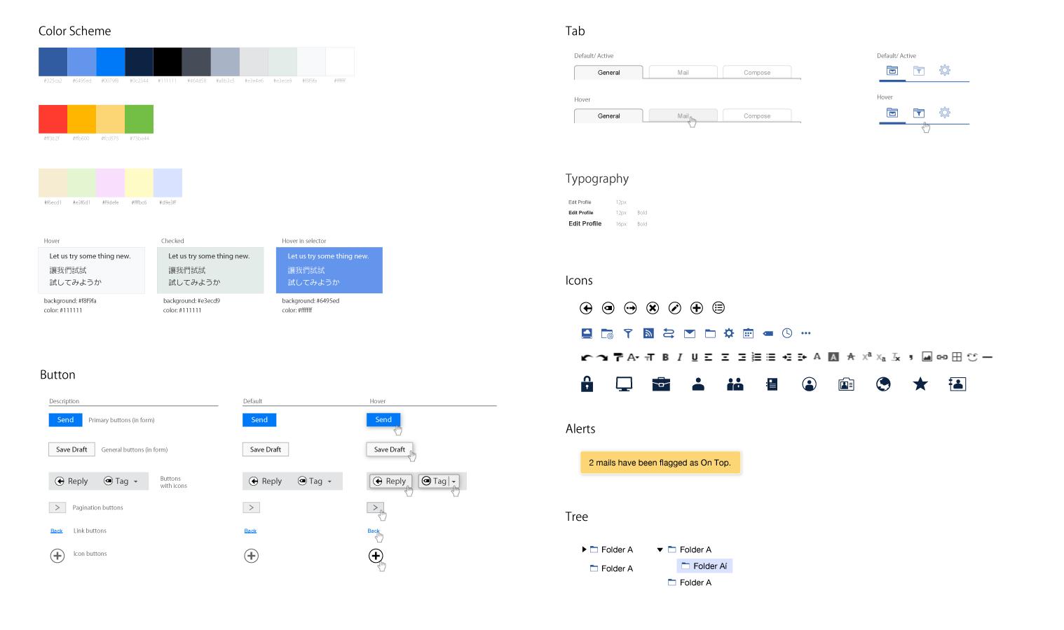 Fig. 7 Partial detailed SPEC
Execution
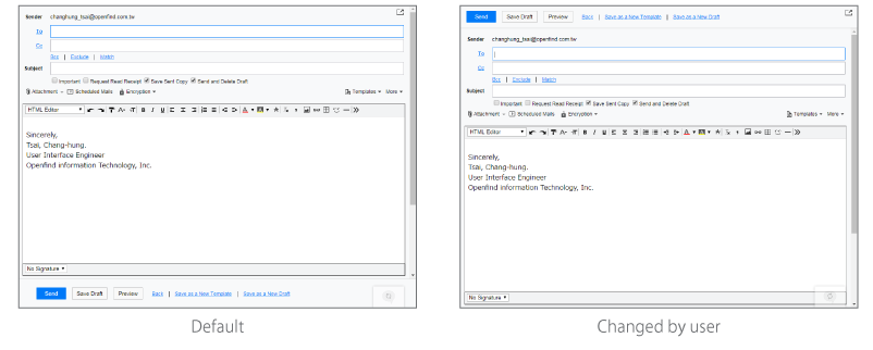
Compose
Users could just use keyboard to finish a mail, and we improve the usage of html editor as well. In addtion, in V7, we can simply attach files by drag and drop!
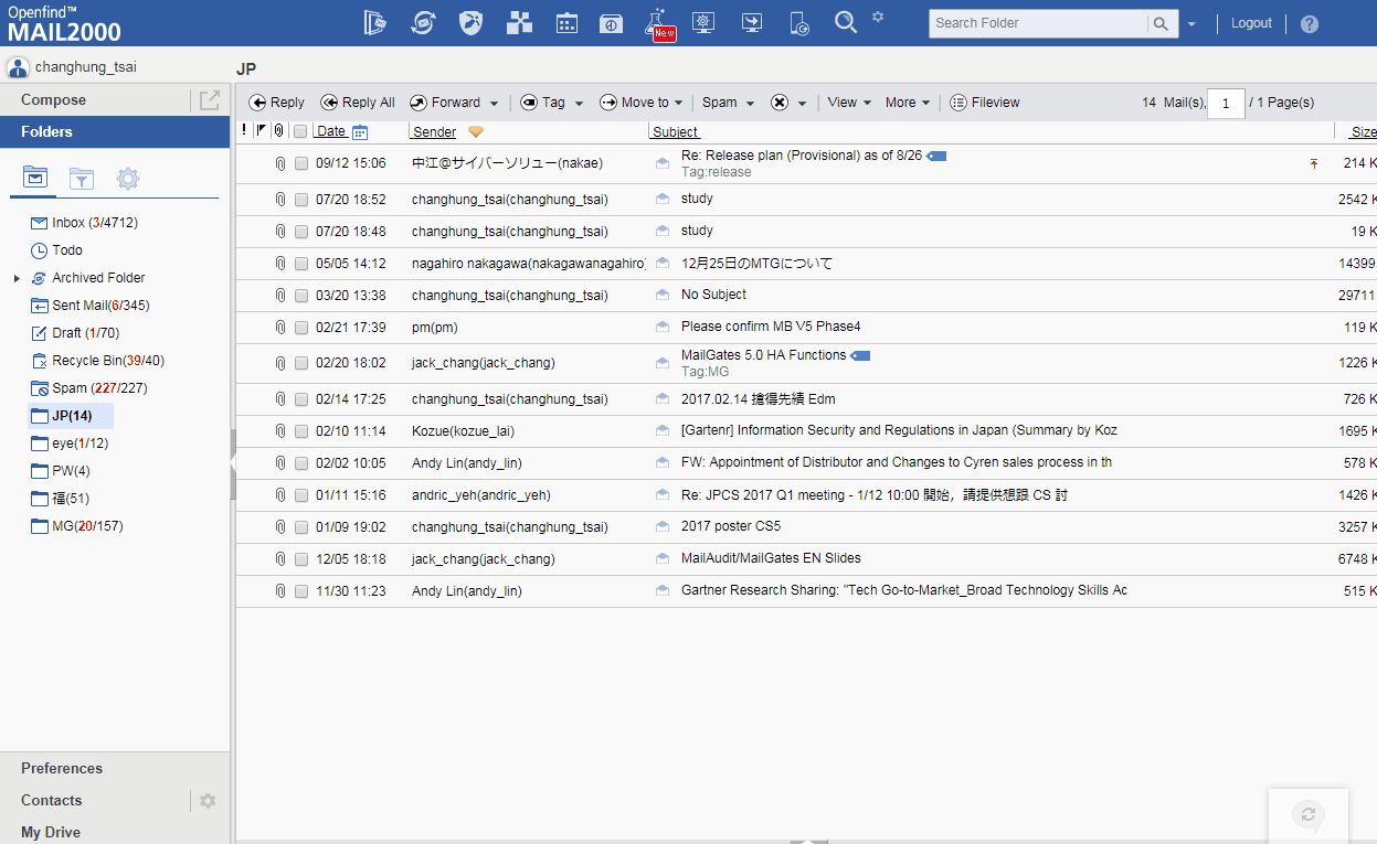 Fig. 8 Uncluttered Compose layout
Contact
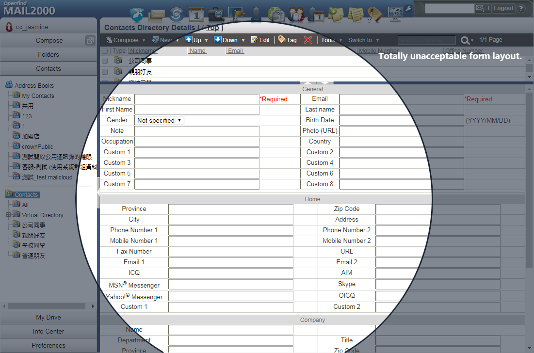
In V7, we redesigned the flow of choosing a item in table data, user won't be forced to see the alert message "Please choose the item first!" again, and we can adjust the width of each column (even reorder the field) if we want.
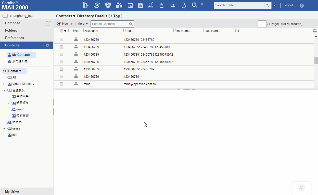 Fig. 9 Redesigned UI flow that easy to edit a contact
Color Palette
To enhance the feeling of Mastery, we provided lots of flexible features regarding to personal preference.
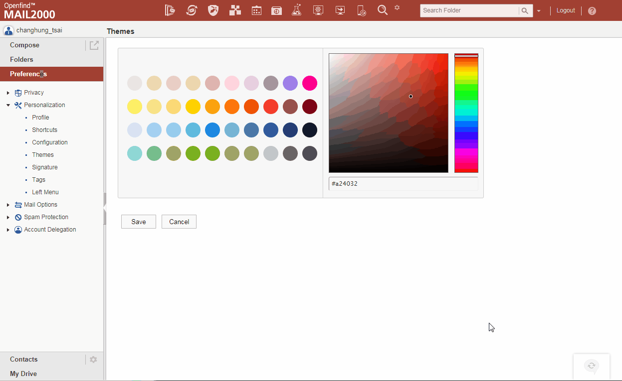 Fig. 10 User can customized main color for him or herself.
Add a new contact
We optimized the form of add a new contact, user can understand what to do clearly and end it quickly bacause we only provided the essential input and hide some advanced options.
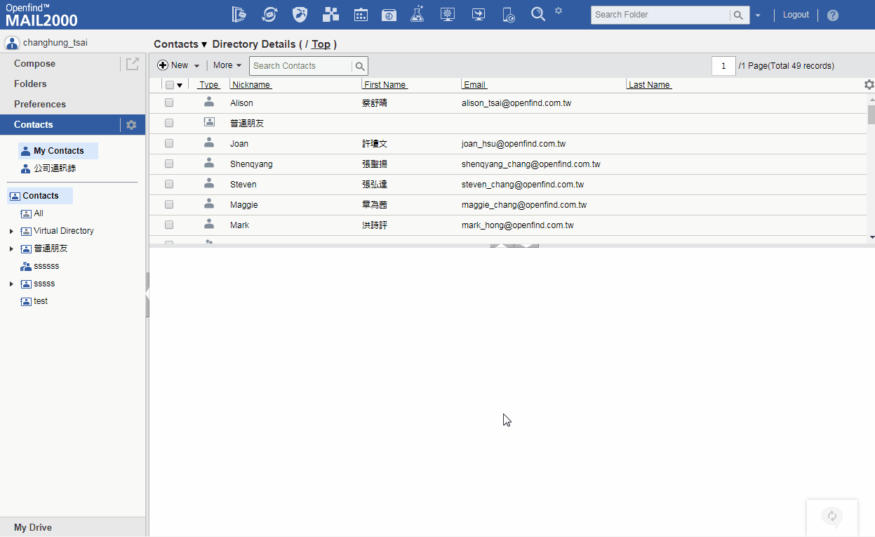 Fig. 11 Redesigned UI flow that easy to create a new contact
Attachment
Responsive and clear information.
 Fig. 12 New feature when clicking an attachment
Refinement
" We are ready for use !! "
Internal Release
After two months of development phase, we ran two rounds of iteration rapidly in order to validate our overhawl. We divided all of the V6 users in Openfind into two groups: one group including 31 people and they were relatively Experts, and the second group including the rest of 55 people.) We hightlight the "Compose" feature and conducted usability testing because we guessed users would feel quite different when facing the new compose UI.
(As the picture shown in below, we were updating the system on May 31 2015.)
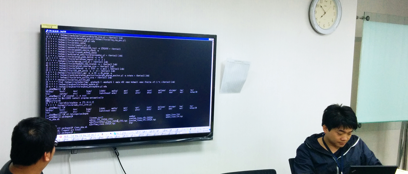 Fig. 13 We were updating the system on May 31 2015.
Result of Round I : VIP users
Like what we said before, current users have their own path to accomplish their task, and any change of UI would probably carry some risks, such as upset them because everything is changed. All of the participants in the first round were internal users, they gave us plenty of feedback as follows.
 Fig. 14 MailView ⇔ FileView (Prototype Version I of FileView)
-
- Some of them get tired eyes after using V7 all day. I decided to reduce the brightness of backgound-color.
-
- Comparing the Send button, V7 is in the bottom of the compose page but in V6, the SEND button was in the top. (Although there was another one in the bottom, and hard to be found.) The fact is, nobody failed in compose, but some of them felt unfamiliar. In the other words, their perfomence of the task "Send a mail" was good, but their satisfaction toward the position wasn't. Now that "Mastery" is an indicator we've got from research, so we decided to make it as one of user-level preference. (And defualt is in the bottom.)
Result of Round II : Totally internal release
We fixed and verified some critical issues following the priority, now it's time to face the users that didn't know any plans of V7 before.
" I feel relief and now I have the courage to deal with those mail folders stuffed unread mails because the UI is so tidy that the unread count is too attractive. "
─ Sales
" It's every simple to send a mail, and this system is flexible bacause I could change into my favorite color, and rearrage the column and field, line height and font size, now its mine and work on my own way. "
─ newbie member
What I learned
After 7 months of develpment, we finally released V7 and on July 14 2015, we had the first updated customer in Taiwan, and the first new customer in Japan after 6 months.
Nowadays, we are serving over more than 200 enterprise (64,813U in Japan, more than 1,000 domains in Taiwan and China, they are stably using the Mail2000 V7.
Do not try to test customer tolerance. Before starting on design, make sure what on earth do users' wants and desires. In our case, a fancy UI with animation dosen't matter to our users. Performance, Simple, Effective mattered that most.